Your Cart is Empty

Colour inspiration from nature can enhance the spaces we live in. We are subconsciously affected by the colours that surround us everyday. Research shows that colours and textures from nature can benefit our happiness and wellbeing, part of an approach known as Biophilic design and taking inspiration from nature's colour harmonies is central to how I work as a designer.
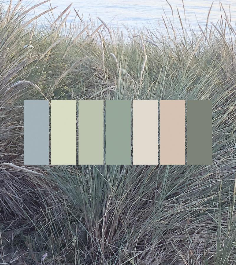
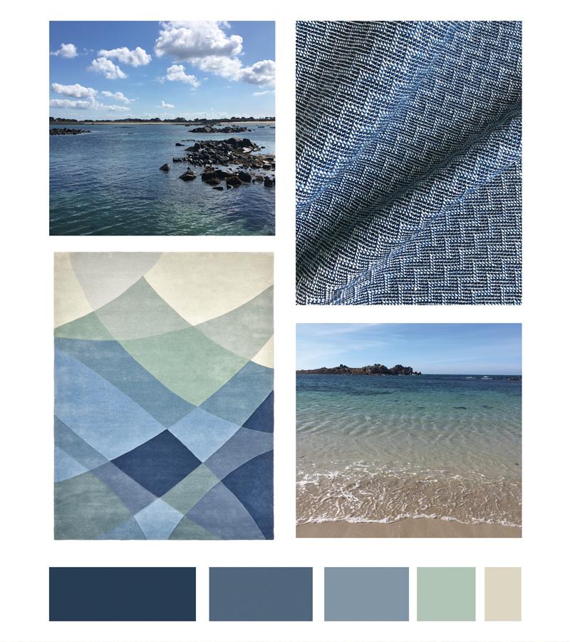
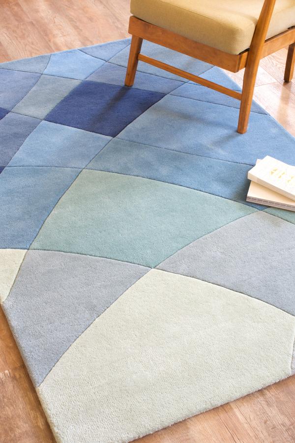
These colours create a sense of space and openness. Paired with light neutrals, these grey-blues are synonymous with calm and relaxation. A hint of aqua lifts and harmonises the palette.
This nordic blue rug with a caramel coloured pattern has a simple irregular loop-pile stripe to depict the incoming waves, crashing one after the other on shore at Portinfer Beach, Guernsey. The loop pile pattern creates a textural contrast with the cut pile background.
The Fontenelle Rug takes inspiration from the northern coastline of Guernsey in the Channel Islands. Here, the colours of the sea and sky seem to merge together in the shifting light and accents of yellow lichen, akin to brushstrokes across the shoreline, and wild flowers on the headland add a glow to this colour palette.
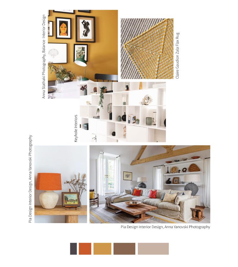
Yellows and golds blend well with neutrals and blues. Introducing highlights of yellow adds warmth and enhances natural light in north-facing interiors. While the well-balanced mix of warm and cool shades in our Fontenelle Rug makes it equally well suited to spaces that enjoy a more sunny aspect.
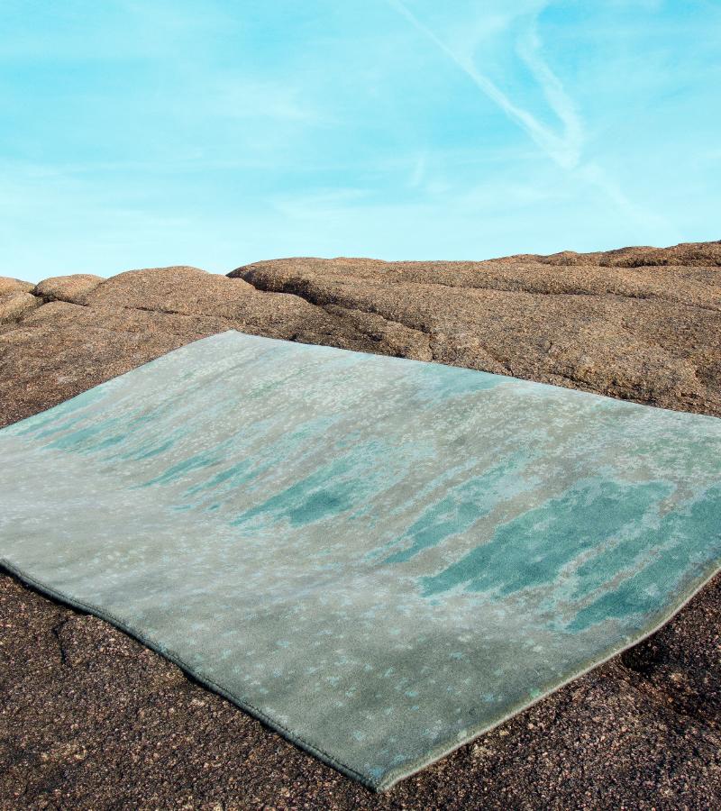
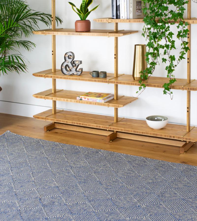
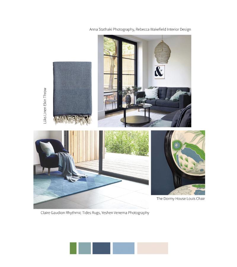
This blue-green colour story explores the colours sea and the patterns of the tides on the shore. Similar to a musical chord, combining different tones of blue creates a harmonious, layered effect. The neutrals and hints of celadon green add interesting base and high notes to the palette.
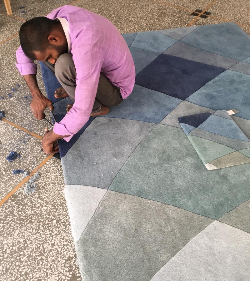
The tone-on-tone effect of the blues in our Rhythmic Tides Rug is complemented here by light walls, mid grey flooring and dark furniture, plus warm wood surfaces.
Repeating rhythmic patterns are everywhere in nature, from the ebb and flow of the tides to the patterns in the rocks and sand. Mixing up patterns and textures brings layers of stories into the design of our homes.
Time of the day, time of the year, and the weather, all effect how we perceive colour in natural light. In interiors, the quality of the light and whether a room faces north, south, east or west add to the magic of colour. Rich warm colours can add a lively mood to a room. Warm and saturated colours appear to 'pop' and advance forwards in a space. In contrast, cooler, paler colours tend to the opposite and recede away, so adding complimentary blues or neutrals will soften the effect and create the right balance.
Time of day, time of the year, and the surface that light is reflected on all effect how we see colour. Contact us to order a fabric swatch or a rug sample to see how our colours will look in your room, we'd be happy to help.
If you'd like to know more about colour inspiration from nature and the benefits of Biophilic Design and Biophilic Colour, you can read more HERE.