Your Cart is Empty

 Blue is frequently cited as the Western world's favourite colour. Why? Well, the emotive power of colour has been debated for generations and remains a contested topic for discussion.
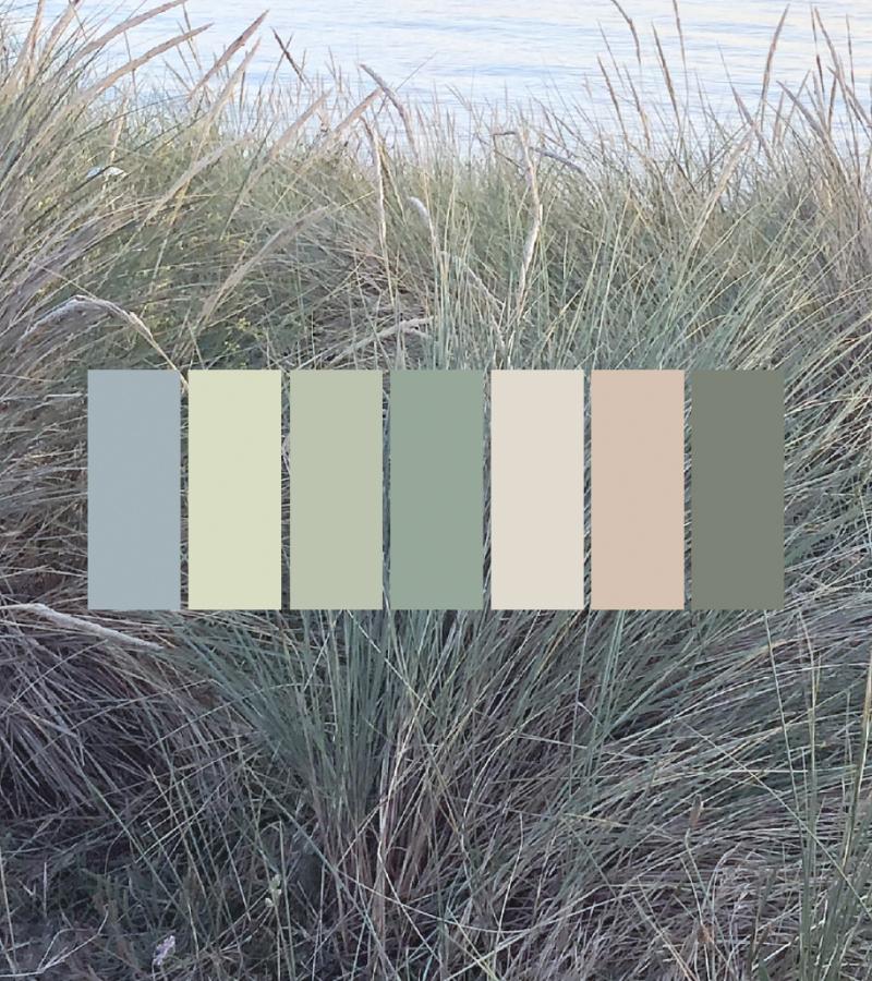
Here are three very different colour palettes that explore the spectrum of blues seen in nature. Think about each colour palette in turn and explore how it makes you feel and compare your emotional response for each.
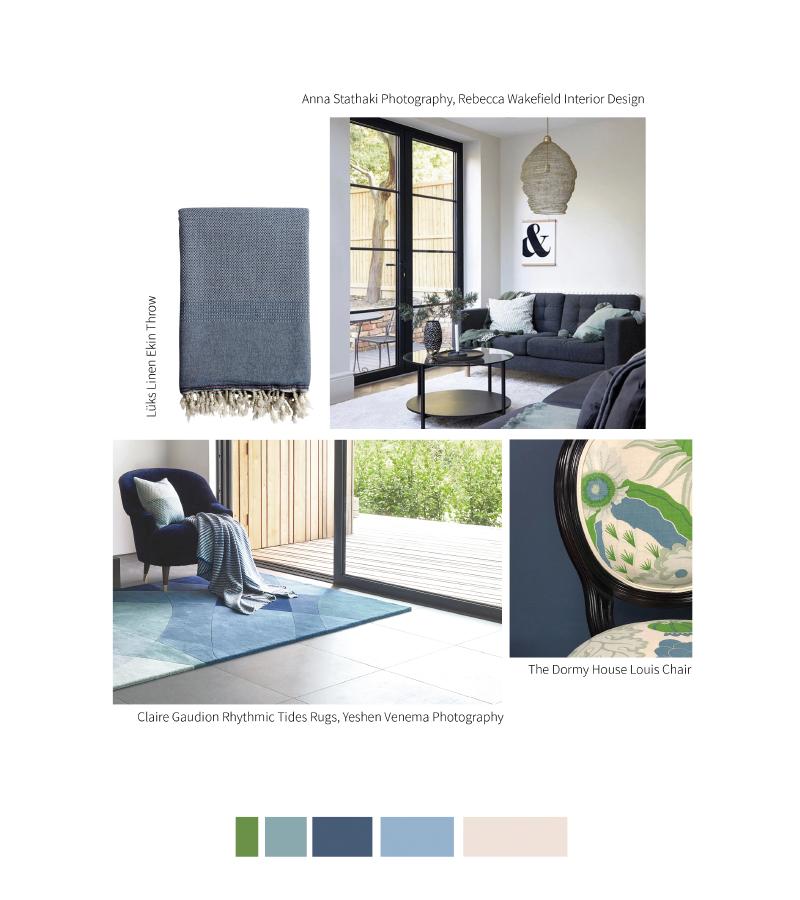
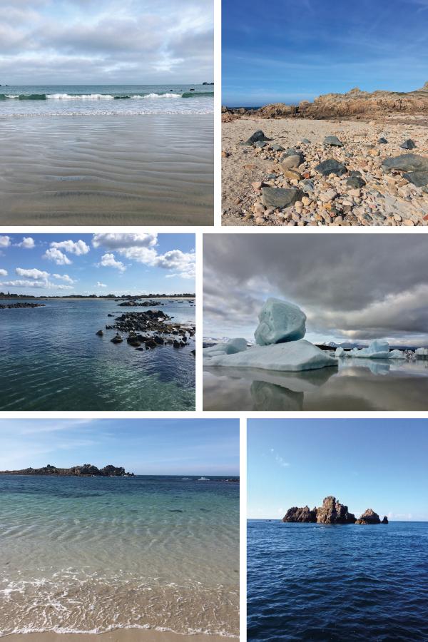
Blue colour scheme featuring clockwise from top left: Portiner Rug, Iceland Jokulsarlon Lagoon, Turquoise Throw, Guernsey Pembroke Bay.
As you consider your emotional response to each colour story, remember that colours can trigger positive and negative emotions. The colour blue has been said to lower blood pressure, relax and focus the mind and instil a sense of calm. This is turn can naturally boost creative thinking, inspiration and confidence. But too much of this calming effect could induce sleepiness and reduced concentration. Getting the balance right by exploring how the mix of colours and tones works for you is the key.
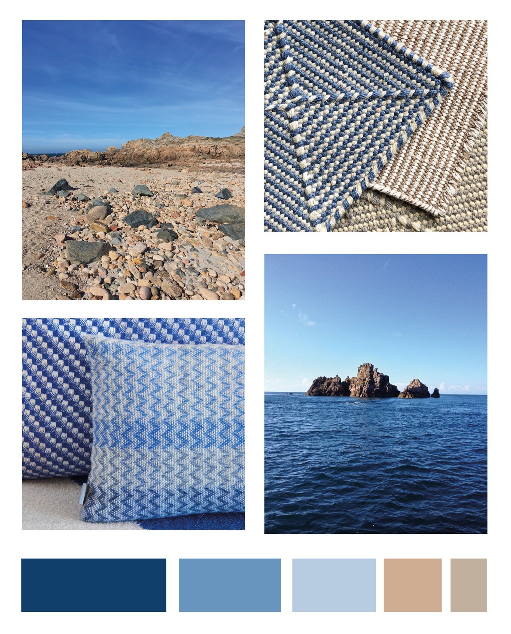
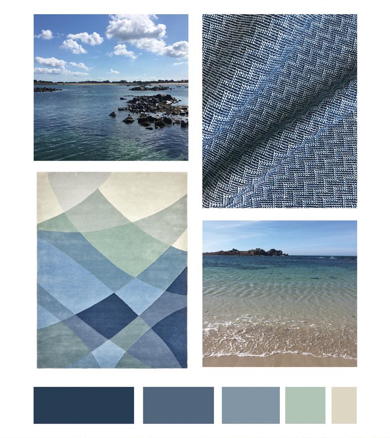
Blue colour scheme featuring clockwise from top left: Guernsey Grandes Rocque coastline, Recycled Plastic Bottle Zala Denim Rug, Fermain and Cobalt Cushions, Les Burons Sark.
As you can see, different shades of blue can create very different emotive responses, from calming and relaxing, to refreshing and uplifting, or energizing and invigorating. Our emotive response is driven not only by the colours themselves, but also by the chroma – how saturated, or muted, the colour is. Any of these colour palettes can be customised by changing the proportions of each colour, or increasing or decreasing the intensity of the colour to heighten or lower its’ affects.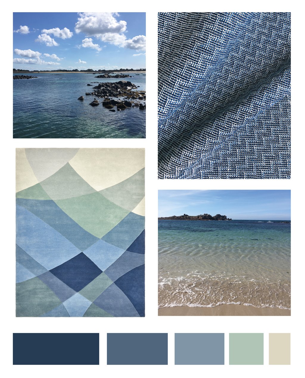
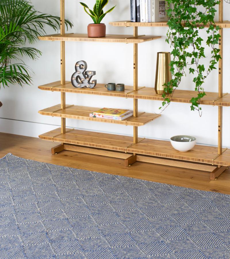
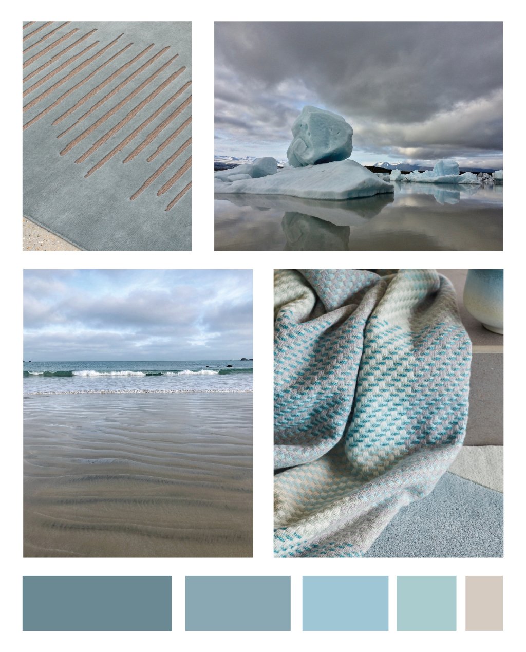
Blue colour scheme featuring clockwise from top left: Guernsey Rousse Harbour, Organic linen Wave Midday fabric, Rhythmic Tides Indigo Rug, Port Grat Bay Guernsey.
For more advice on colour, you may be interested in reading:
How To Choose Colours For Your Home
Understanding How We React To Colour
Fascinating and Useful Things To Know About Combining Colours