Your Cart is Empty
FREE UK SHIPPING OVER £300 SPEND

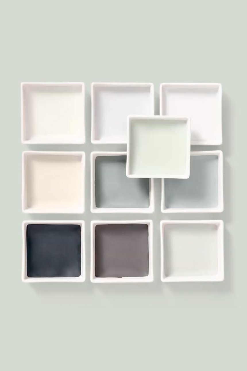
Colour is transient and transformative, changing with the changing light and its’ surroundings, and these palettes illustrate this beautifully.
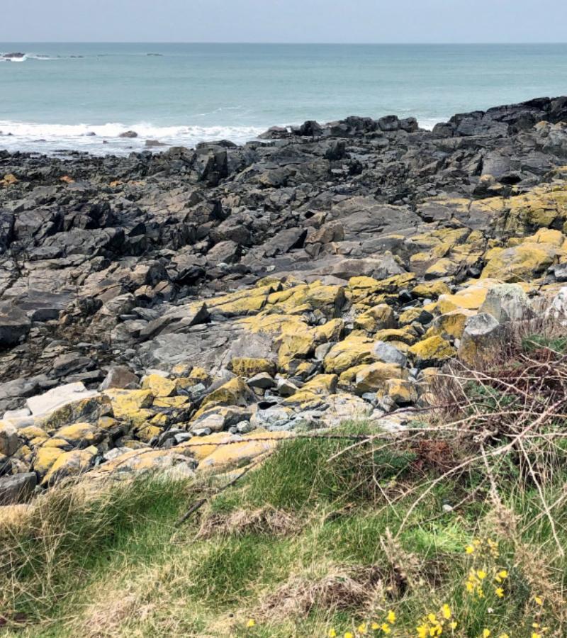
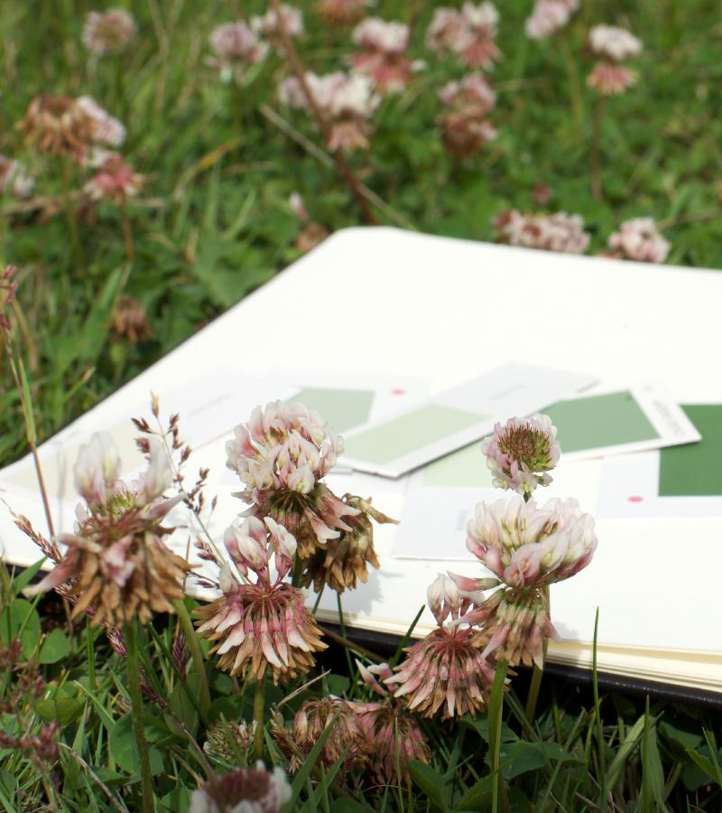
Autumn is here and the colours around us are changing. This season heralds the dawn of a new year in the design industry. Companies begin to launch new collections and announce their colour predictions for the coming season. Colours forecasts are selected following intense research and discussion to consider the cultural, emotional and behavioural significance of colour to our world today. Paint brand Dulux has just announced its colour of the year (COTY), Tranquil Dawn, a soft muted green with hints of grey and blue. This colour is intrinsically connected to nature.
Marianne Shillingford, Dulux's UK creative director, compares the COTY Tranquil Dawn to "the space between the land and sky”.
This colour is presented along with four colour palettes that show this colour in action, as it were, in four very different ‘moods’; care, play, meaning and creativity. Each of these palettes inspired by the colours of dawn at different times of the year, recognising nature’s changing colours through the seasons.
Dulux’s COTY is “Inspired by the changing sunrises that paint the sky in different seasons”.
Human’s drive to reconnect with nature as a promoter of wellbeing is a theme that is growing in momentum. The thinking behind Dulux’s COTY is about a new beginning and the need to focus on human connectedness, facilitated by colours of nature.
“We are at the start of a new decade, a new dawn. The world is full of possibilities which is why our colour team, when choosing a shade that brought to life our desire to treasure our most human qualities and give our homes ‘The human touch’ looked to the soft, fluid colours and tranquillity of the morning sky for inspiration.” Marianne Shillingford
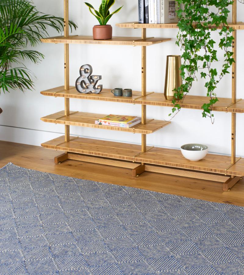
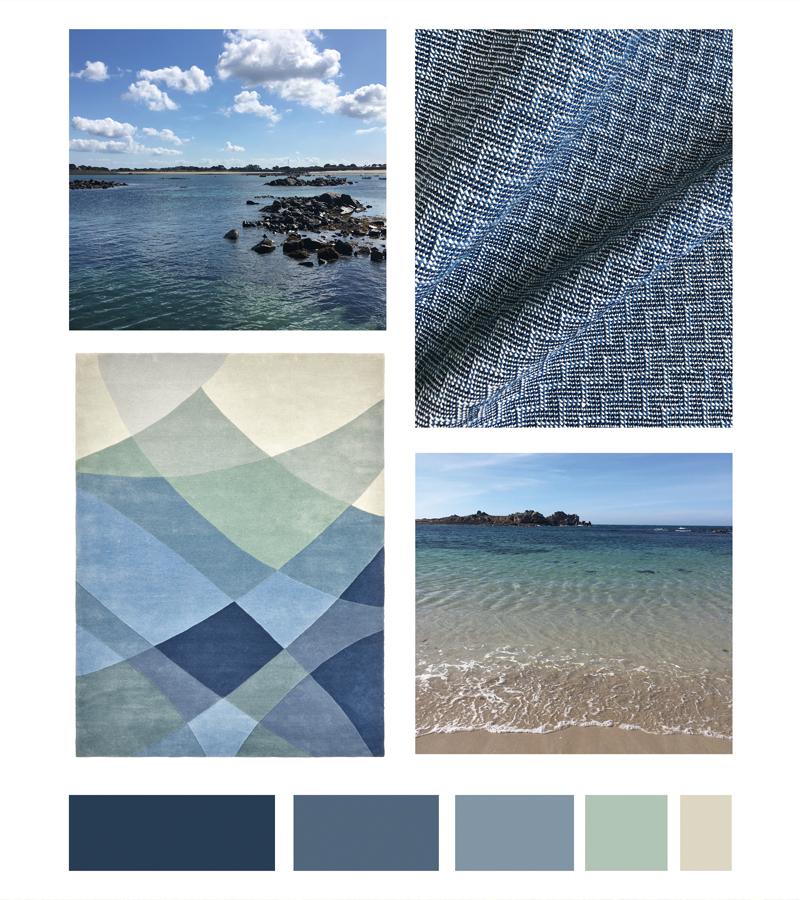
Dulux identifies four human qualities - care, play, meaning and creativity - and translates these into seasonal colour stories. As you view each of these colour palettes, notice how the versatile colour Tranquil Dawn appears to change colour when combined with different neighbouring colours. Colour is transient and transformative, changing with the changing light and its’ surroundings, and these palettes illustrate this beautifully.
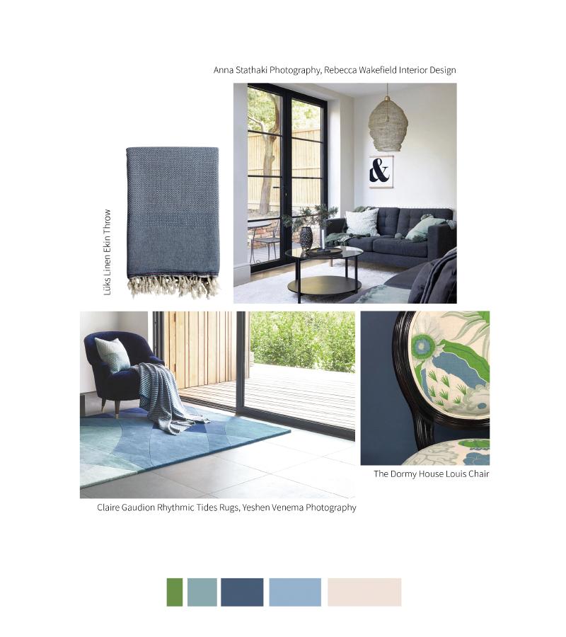
A balanced palette hazy neutrals which create an soothing and relaxing feel with it’s a blend of earthy neutrals, delicate pinks and watery blues. Tranquil Dawn green has a soft muted freshness about it in this group of nurturing colours.
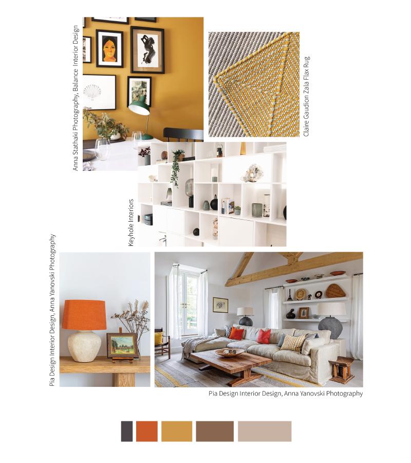
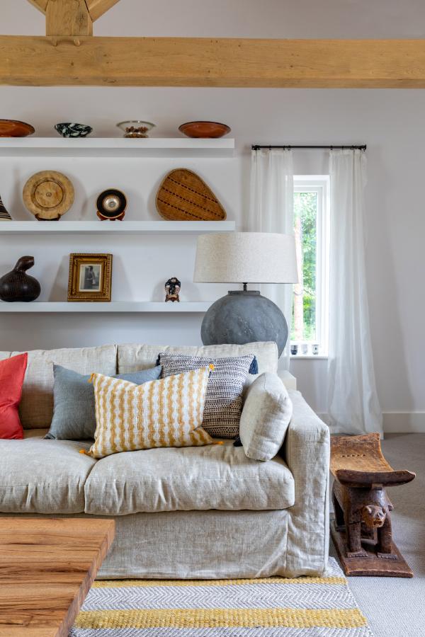
Here, Tranquil Dawn becomes almost neutral, a backdrop to the stronger richer shades. Tranquil Dawn appears paler in contrast, and takes the role of a highlight to lift the drama of maroon and tobacco hues, moss and forest greens. These colours are moody, atmospheric and eclectic.
A contemplative and minimalist palette that mixes cool greys with warmer neutrals, creams and charcoal hues. Tranquil Dawn appears as an icy green, creating a palette reminiscent of a crisp winter’s dawn.
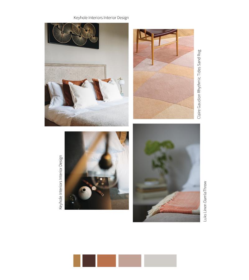
In this palette, Tranquil Dawn acts as a springboard for a joyous mix of delicate pastel shades and more saturated and vivid colours to bounce off. The brights in this palette are full of energy and make for good accent colours among the pastel tints.
Decorating tip: choose the colour palette that resonates with you most and play around with the colours in different proportions to find the balance that connects with you.
Nature is clearly exerting its’ influence on the world of interior design colour. Discover more about Tranquil Dawn and how Dulux style this colour four ways on their website.
Significant recent research shows that the colours of nature used in interior design can bring an immense sense of wellbeing and happiness to our indoor environments; this is part of a concept known as Biophilic design. You can read more about Biophilic design and colour on our blog, HERE.
You may also be interested to read about Pantone's Colour of the Year, Living Coral, and see how we style it four ways, HERE.
Colour is an emotive thing, and everyone has an opinion on colour. Follow your instincts, and find the colours that resonate with you.