Your Cart is Empty
Black Friday Sale from 23rd November to 1st December 15% off Discount code: BLACKFRIDAY plus FREE UK DELIVERY

Seasonal change brings with it a shift in outlook for many of us, and a refocusing. At this time, we also see a host of new collections and trend predictions for the year ahead. It is the beginning of a New Year for the interiors industry.
Every year, teams of designers, architects, colour creatives and trend experts from high profile companies gather insights from across the globe and pull together a collective mood of the nation, along with consumer trends and translate these forward-thinking ideas into colour. One colour, or a palette of colours, which surmise the mood and directional aspirations ahead of us. You can read more about where trends come from in our previous article, Colour Trends for Interiors and the Language of Colour. As we discussed then, it is fascinating to witness such predictions and narratives and how colour, a powerful driver of emotion and behaviour, can respond to the world around us.
This year, the influx of new paint colour introductions, colour trend forecasts and inspirational images is as enticing as ever.
Image: Farrow & Ball, Sulking Room Pink
Experts in colour, Farrow & Ball introduce nine new paint colours. Every few years Farrow & Ball launch a new range of colours, and archive some others. Drawing on lasting design trends and the expertise of their colour consultants they have developed nine new rich pigments to update their curated palette of 132 colours. Farrow & Ball’s international colour consultant, Joa Studholme, tells Kiera Buckley-Jones in ELLE Decoration, that designing new colours is “a gut reaction that comes from being immersed in the world of colour, day in, day out.”
Image: Farrow & Ball, Paean Black
There is a balanced sense of both trend and longevity to their new pigments. Trend-led pigments include Paean Black, ‘a chic red based black’, and Jitney, ‘a relaxed brown based neutral’ which are introduced as new contemporary colours for the modern home.
The timeless enduring neutrals get an update, and then there are tweaks to favourite hues to suits todays market. New tones, with equally good names, such as Sulking Room Pink, ‘a romantic and muted rose’, continues our rediscovery of pink.
In conversation with Kiera Buckley-Jones, Joa Studholme talks about how homeowners are becoming braver in their use of colour, and of the rise in popularity of colours of nature:
“Deep greens and blues feels protective, so have started to be used in living rooms that we retire to at night. Also, in times of international turmoil, we all tend to gravitate towards warmer red-based colours that make us feel like we are being given a great big hug and make us forget about the world outside.”
Image: Farrow & Ball, De Nimes
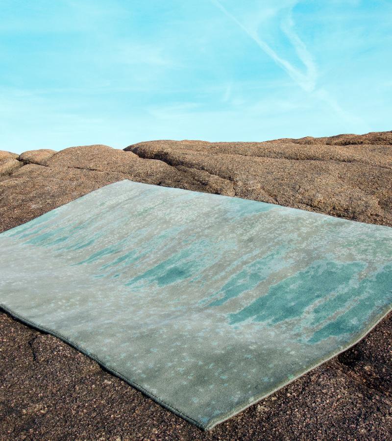
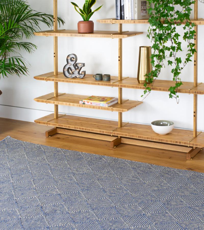
Our current favourites are De Nimes, ‘a down to earth and grounding blue’ named in reference to the French town where Denim was first woven, and Treron, ‘a dark green grey’, described here in Farrow & Ball’s own words. Both of these colours would sit well with our Zala Denim Rug (made from recycled plastic bottles) and our Rhythmic Tides Indigo Rug which mixes varying tones of blue, green and grey into a very nature inspired palette.
Image: Claire Gaudion Zala Denim Rug
Image: Claire Gaudion Rhythmic Tides Indigo Rug
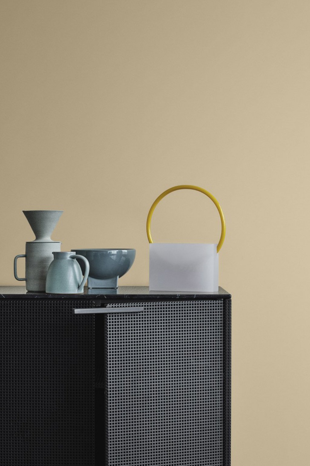
Dulux is another much anticipated Colour of the Year (COTY) announcement. Marianne Shillingford, Dulux UK’s Creative Director, describes their Colour of the Year 2019, Spiced Honey, as being “inspired by the varied tones and remarkable properties of honey — natural, timeless and enduring, protective, rejuvenating and healing” it’s a warm tan tone, like “salted caramel with a hint of amber”. The colour is said to represent a new sense of optimism and resilience.
Image: Dulux Colour of the Year, Spiced Honey
Spiced Honey is a beautiful nature-inspired tone. It is a relaxed, yet rich earthy shade with caramel biscuit undertones. Spiced Honey invites the layering of colours and textural contrasts.
Image: Dulux Colour of the Year, Spiced Honey
Living Etc magazine sees this warm inviting colour as a wintery upgrade to the barely there, warm, earthy neutrals that Michelle Ogundehin (former Editor in Chief of ELLE Decoration) might describe as New Neutrals. To track this transition of a trend, Michelle Ogundehin suggests a new style, ’Soft-Scandi’, a look which has an emphasis on texture, mixed with gentle washes of colour.
There seems to be a general consensus that this colour should be layered, mixed and combined, with other colours and with natural materials. As described by Dulux themselves, Spiced Honey can be soothing or calming, cosy or vibrant, depending on the palette you pair it with. This colour is not designed to be used alone, and Dulux beautifully present four complimentary palettes to reflect these moods.
Michelle Ogundehin is not convinced by this as a flat colour for walls, and instead sees it “as representative of natural finishes and textures”. Michelle Ogundehin has already talked about her prediction “that we’ll see an increase in the use of materials like rattan, cork, plywood, sisal and hemp” and how these materials represent “a celebration of texture and tactility as an antidote to our increasingly smooth, screen-based worlds”.
Jotun’s colours are always eagerly awaited. For 2019, Jotun present three colour stories; calm, refined and raw.
"The home is the story of who we are. Told through the things we provide space for and the colors we surround ourselves with." - Lisbeth Larsen, Jotun
This quote from Jotun's Global Colour Manager (spotted on Eclectic Trends) is a perfect summation of how home and colour relate.
Jotun's new colour stories, in their own words, are:
Calm “This new palette of neutrals creates the finest balance between the cleanliness of minimalism and the energy of colour. Slight shifts of shade in monochrome spaces adjust the atmosphere by degrees, towards welcoming warmth or cool, contemplative stillness.”
Refined “Past and future, human eccentricity and tech-inspired design, sit side by side in a vibrant, sense-stimulating palette of greens and yellows. Changes in colour create new contexts and moods, while every eclectic article in our homes forms a personal story.”
Raw “Reground yourself in modern rustic spaces – easy on the eye and stirring to the soul. Deep earthy reds, sensuous peaches, greens and autumnal browns carry a promise of simpler living. A contemporary, boldly feminine palette balances rawness and refinement, the hand-crafted and clean-lined modernity.”
Last years colour predictions also saw a need to reconnect with nature through a pigmented, soft and tactile take on neutrals with a discussion around wellbeing in interior design. This Biophilic theme seems to be growing and gathering force into 2019-2020.
Image: Claire Gaudion Rhythmic Tides Sand Rug
The paint company's discussed above make reference to ‘contemplative stillness’, ‘simpler living’, ‘down to earth and grounding’, ‘balanced and calm, and ‘optimism and resilience’.
What’s your take on these new colour stories? And what sort of emotional responses do they trigger for you? We would love to hear your thoughts on this... join us on social media using the links below.