Your Cart is Empty

There are so many things in the world that influence how we live, the choices we make and the way we see the world around us. In design, colour plays a leading role. Colour defines our seasons, influences our mood and behaviour and effects how we experience our homes. We are fascinated with colour here at the Claire Gaudion design studio. As this new year begins, we take a look at the colours being talked about for the year ahead, how and why these colours are highlighted as significant and by whom, and how the world around us can be interpreted into the language of colour.
Whatever you take on 'trends' and 'colours of the year' (and we're not ignoring their commercial use), colour forecasts are a fascinating subject because of the power of colours to affect our emotions and behaviours. Colour forecasts are usually presented as a collection of colours, a palette which portrays an emotive story or mood, or just one colour, to sum up a collective mood. A complex research process which reflects on and responds to our changing world is interpreted into colours that are predicted to be sought after and to enhance our lifestyles.
Trend forecasting is happening across the design industry, all of the time. As textile designers, we are continually thinking about which colours will be in our new collections, we too reflect on the world to offer our own independent interpretations of colours for today and tomorrows interiors. But the big players are those directional colour and trend forecasting companies, such as Dulux, Jotun, WGSN and Pantone, who publish high profile colour trends on an annual basis. Trend forecasters are ‘brailling the culture’ to identify and respond to lifestyle, design, technology, political, economic and environmental factors that influence trends. They trawl design fairs for new stand out designs - Claire Gaudion designs have proudly been spotted and featured by Pantone and WGSN in trend reports - as well as closely watching market leaders to track and recognise new trends. Whether trends begin with independent designers, or with global directional paint and colour companies, colour forecasting is a complex phenomenon.
Colour psychology is such an important element of design. There are so many elements that effect the way be see and respond to colour; personal preference, experiences, upbringing, cultural differences, context, etc, that it is difficult to claim any universal understandings or preferences associated with individual shades of colour in isolation. Sweeping statements such as 'green means calm' may be inaccurate depending on the tone of green and the context in which the colour is viewed. Colours can mean different things depending on how they are used and combined. Importantly, we rarely see and react to just one colour independently. The world around us is full of many colours, and our behavioural and emotional responses are to all the colours that we can see simultaneously. When colours are used in combination broader messaging patterns can be found. Like art, or a musical composition, a collection of colours tells a story, and more clearly conveys a feeling or mood.
The creation of colour forecasts is really about interpretation, using the language of colour and choosing which colours best tell the story or conjure the right mood. Companies presenting colour forecasts usually offer a palette of colours, or colour harmonies alongside a 'hero' colour, and illustrate these with stunning interiors and lifestyle imagery and descriptions to convey their meaning.
Ultimately, it is consumers who decide which forecasts become trends, if they resonate with consumers needs and lifestyles. Media coverage can also sway consumer opinion, of course. With information being shared across the world with such immediacy and by so many in today’s world, influencers have a powerful effect on the growth of a trend.
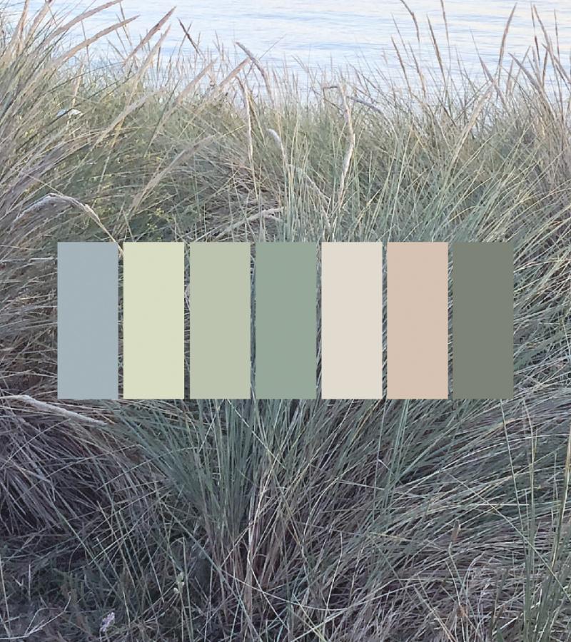
There is much overlap in the forecasted colour directions for 2018, with common narratives and preferences. As WGSN, a world-renowned trend forecasting company, reports, there seems to be two main directions for 2018: the need to reconnect with nature and a readiness to dare with colour.
“The need to reconnect in more authentic ways with nature through a pigmented, soft and tactile take on neutrals.” WGSN
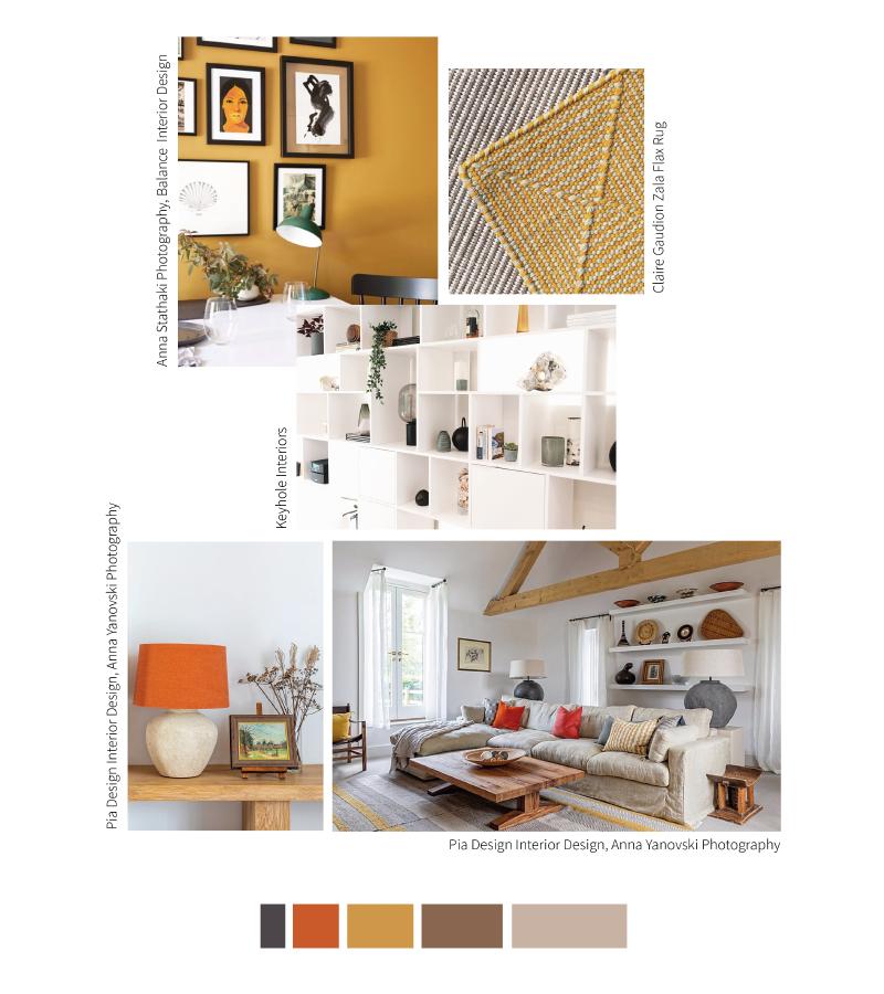
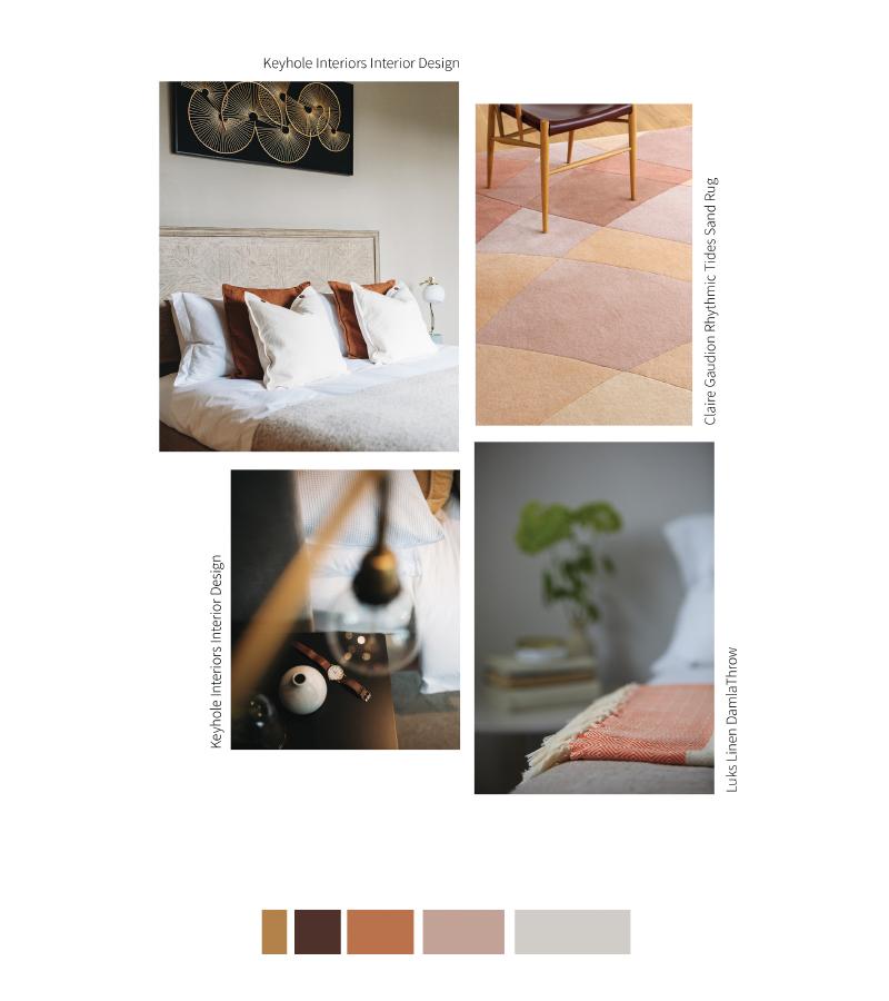
Dulux tunes in to this muted approach to colour with soothing, tinted matte neutrals and their hero colour of the year, Heart Wood. Dulux elaborate on this colour story by sharing several ways to use the colour in interiors, with supporting complementary palettes for consumers to choose from. We can see from these four colour stories - Heart Wood, Comforting, Inviting and Playful - how different a single colour ‘heartwood’ can appear in different combinations.
“Heart Wood, a beautiful warm neutral with a hint of heather, is Dulux Colour of the Year 2018. We’ve identified a global need for homes to feel even more nurturing than before – and this is where Heart Wood comes in” Dulux.
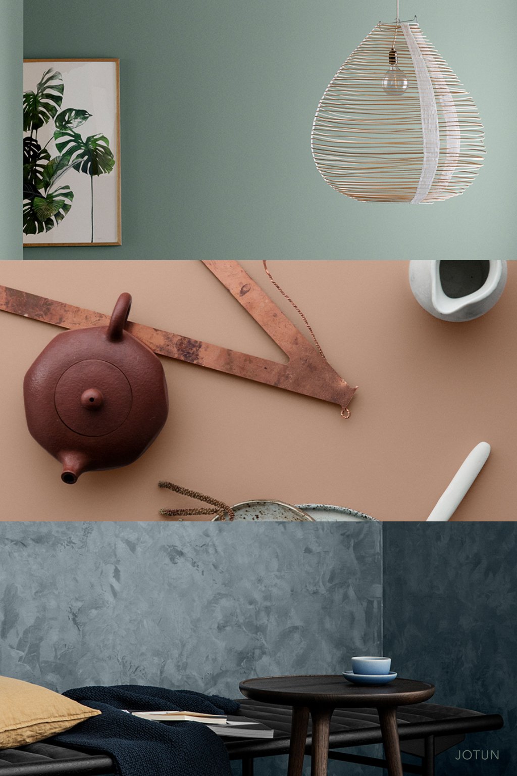
Norweigen company Jotun, one of the largest global paint brands, present a collection of colours entitled ‘Rhythm of Life’. Jotun describes their palette as a reflection on “the ideas, values, dreams and realities shared by people around the world.” Tactile neutrals are a strong focus and the softness of the colours suggests slowness, calm and comfort. Jotun presents three colour stories:
City Motions - luxurious inky blue-based shades inspired by modern creative cities Copenhagen and London, Brooklyn and Berlin
Silent Serenity – a nomadic palette that references natural light, open air and soft earth
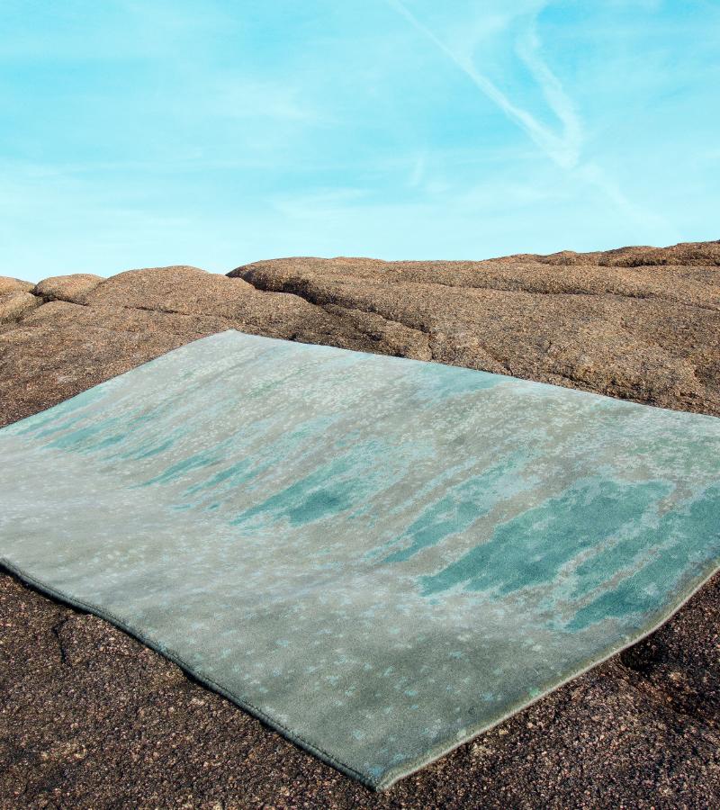
Lush Garden - shades of blue and green to suggest the restorative power of nature, creating a ‘calming sense of sanctuary in which to retreat and recharge’
“Either with daring darks or by experimenting with energetic and vibrant hues that move from feature accents to feature surfaces and rooms.” WGSN
Directional paint companies, Sherwin-Williams and Benjamin Moore, both fit into this colourful direction with vibrant choices for 2018 – Benjamin Moore’s colour of the year is red - Caliente – an eye-catching colour, radiant and full of positive energy bringing confidence and vitality. This is strong high chroma colour to surround yourself with on a large area, so think carefully about how this proportion of colour would make you feel. You may love the colour, but prefer it as an accent for chairs or a statement piece of furniture. Sherwin Williams have chosen a harmonious marine-inspired blue-green – Oceanside – a vibrant and uplifting colour. Each of these hero colours is presented with a complementing palette.
"Caliente is the signature color of a modern architectural masterpiece; a lush carpet rolled out for a grand arrival; the assured backdrop for a book-lined library; a powerful first impression on a glossy front door. The eye can’t help but follow its bold strokes. Harness the vitality.” —Ellen O'Neill, Benjamin Moore & Co.
Colour company Pantone has chosen a vibrant purple shade named Ultra Violet as its colour of the year for 2018. Pantone announces a new colour of the year every December, based on trend-forecasting research from the global Pantone Color Institute. Ultra Violet is said to communicate ‘originality, ingenuity, and visionary thinking that points us toward the future.’ Once again, this is a strong colour that may be more suited to use as an accent in interiors.
Perhaps more interesting than the hero colour alone, are the range of colour harmonies and descriptions presented by Pantone; a collection of eight very different colour stories, once again illustrating how colours used in combination create remarkably different effects. These are our favourites (below) and you can view the full collection of Pantone's palettes and colour harmonies on Pantone's website.
Purple Haze
Intrigue
Whether you are a follower of trends, or prefer to follow your own direction (which we highly recommend!), the common narratives and predictions arising seem to demonstrate that the language of colour can indeed tell compelling stories in response to the world around us.