Your Cart is Empty

Take a look at this image. Focus on the image as a whole, so you see all the colours simultaneously.
Image: Josef Albers, Interaction Of Color, 1963
How may colours do you see? 6? There are in fact five colours in this image. Four coloured stripes, from the top, sky blue, royal blue, yellow and orange. At the centre of the blue stripes is a gold square, and at the centre of the yellow and orange stripes is another gold square. Most people will see these two gold squares as different shades, one lighter, one darker. The gold squares are in fact exactly the same colour gold.One colour is made to appear as two different colours.
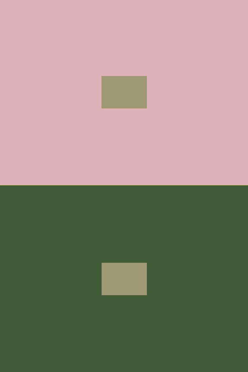
Here’s another example. Most people will see the small squares are different colours, but they are in fact the same colours.
So why do we see them as different colours in this image? The lower half of the image featuring yellow and orange is vibrant and dominant and colour, and the gold square appears darker. The blue stripes are less dominant and appear to recede away in contrast, so the gold square here appears brighter than the other gold square.
The fact that one colour can appear as two different colours, can really add depth to a design. And significantly, the way we perceive colours as darker or lighter, or brighter more saturated colours depending on their neighbouring palette can offer numerous ways to use colour in design. We find it easier to see things with contrasts. So using contrasts can really make colours stand out, or vice versa with closer shades to blend colours together. These are of course useful tips for textile designers and interior designers. Furthermore, the ability of colours to jump out, or recede away can also influence our perception of the size and feel of a space. The use of advancing and receding colours are helpful for example, when you wish to define a space, or draw attention to architectural features, or direct the flow around a room.
The use of a darker green at the end of this hall illustrates how colour can define the shape of a room. The darker shade brings the end of the hall closer and makes the room appear wider rather than long.
Warmer colours (reds, oranges, yellows) and more saturated colours tend to advance towards us and appear more dominant. These colours can make a room feel warm, cosy and intimate. To lessen this affect, we can use lighter shades or less saturated warm colours. Or blend in some cooler, less saturated shades (blues and greens) or that in their pure colour form tend to recede away, and enlarge a space. Lighter colours will also create the illusion of something being further away, and darker colours closer. As we will see in the next exercise, colours are changed significantly in appearance by their environment, and so even blues can be made to look warm.
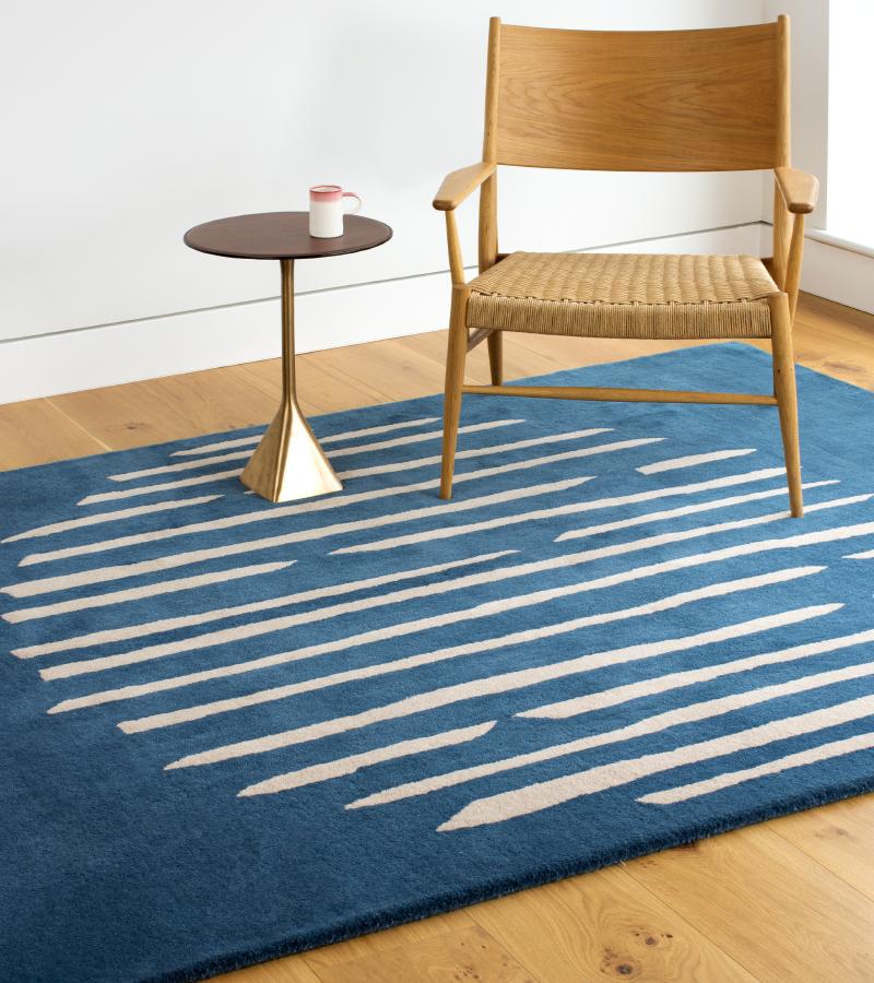
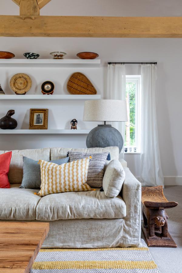
Notice how the sage green and mortlake yellow colours interact in this Little Green image below. The yellow draws attention as the dominant colour and advances into the room while the green on the back wall creates the illusion of a larger room as it appears to recede away. Contrasting colours - the black furniture frames, and almost white chairs and artwork - also influence our perception of colour when we view this space as whole. More on this later.
Image: Little Greene
“Colours present themselves in continuous flux, constantly related to changing neighbours and changing conditions” Josef Albers
Colours are strongly influenced by their neighbouring colours. Take a look at the images below. Cover the colours in the margin then look at the image and focus on the centre of the image so you view the two small pattern details, or colour blocks, simultaneously. See how the centre squares appear as the same colour. Uncover the colours in the margins to see what these colours actually are. Colours can draw colour from their neighbouring colours making them appear quite different in different contexts.
Image: Josef Albers, Interaction Of Color, 1963
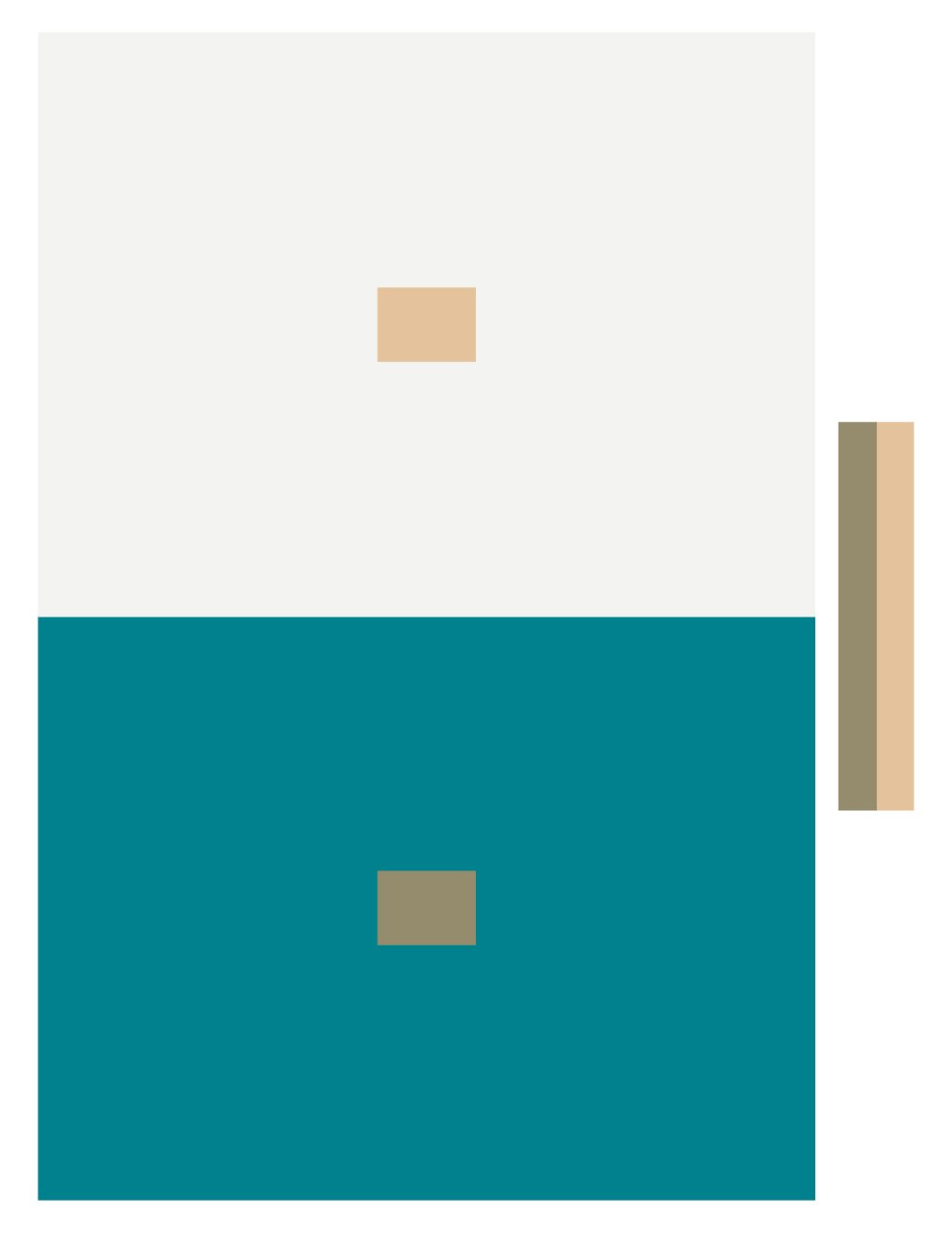
Image: Josef Albers, Interaction Of Color, 1963
Two colours are made to appear as one colour.
Cut up some colour paper, and mix and match some different colours and explore how one colour can changing in brightness or intensity, when combined in different palettes. Notice how some colours will advance and others recede, appear darker or brighter, because they are being contrasted with other colours.
There are innumerable colours. Think of as many colours as you can, then add un-ending variations of tints (colours with white) tones (with grey) shades (with black) and mixtures (colours blended with other colours). The few exercises we have explored already give a sense of the limitless possibilities for interactions of colour and how we may experience colour. But, the interaction of colour does not stop here. In addition to the endless tints, tones and shades, there are still other considerations that will affect how we perceive colour and how colours interact. Neighbouring characteristics of shape and size, repetition and placement, natural or artificial lights, juxtapositions of other objects and textures, to name just some.
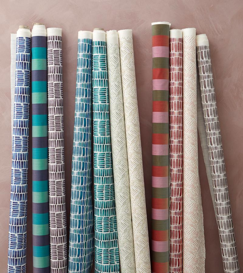
Take a look at this group of 4 panels. 4 designs which each use the same colour, but in different arrangements and quantities. It is likely that we will each have a preference of one of these over the others.
The more complex the arrangements and interactions of colours, and the more characteristics or variables that are added or changed, the more subjective and individual our responses become.
This way of working with colour suggests that there are no rules, or systems that we should follow. Instead we should learn to ‘see’ colour in context, in its unique changing environment and embrace it as a living, breathing thing, easily influenced, and with the charm of a chameleon.