Your Cart is Empty

Colour can be one of the most effective ways to create an environment that nurtures and inspires us. Choosing the right colours to support our mood, emotions and behaviours can be an effective path to wellbeing.
Designing with colour, however, is something that mystifies many. So, we thought we’d share a simple process that you can use as a guide to choosing the right colours for your home. This step-by-step process will enable to you to discover which colour combinations create the effect you want. You don’t need any colour theory knowledge for this – the process is all about exploring how you feel about different colour combinations and your experience of colour.
The first step is define the mood and feeling you want to create. And, specifically what kind of behaviours would you like it to be conducive with? Think about what your room is going to be used for, is it for social occasions and entertaining, or perhaps somewhere quieter where you can relax and unwind after a busy day? How do you want to feel in the room?
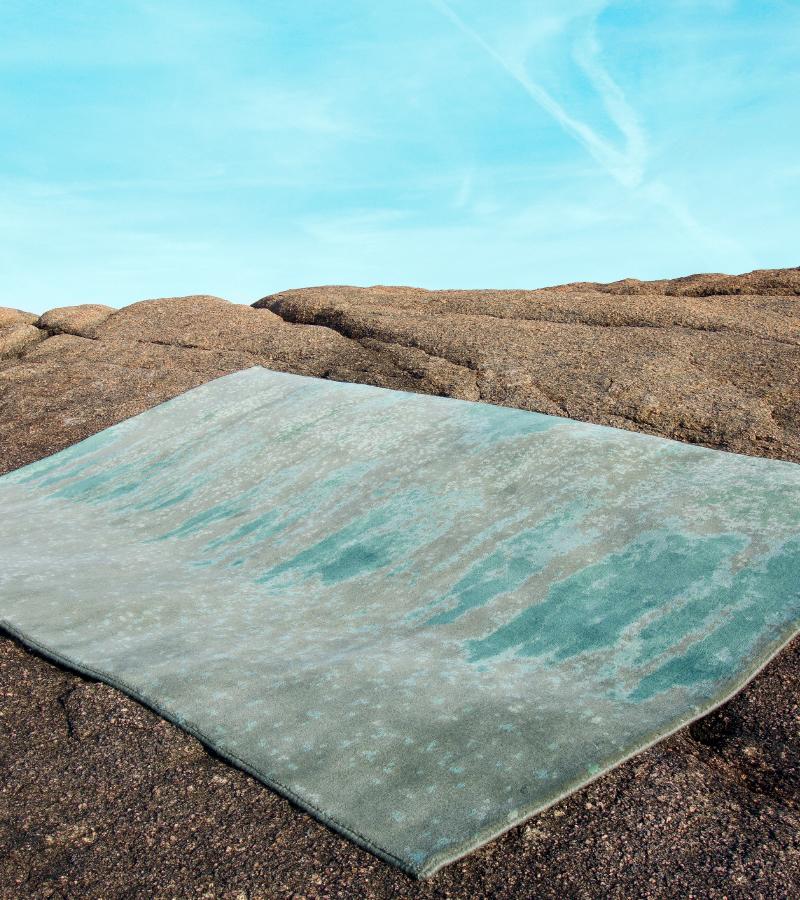
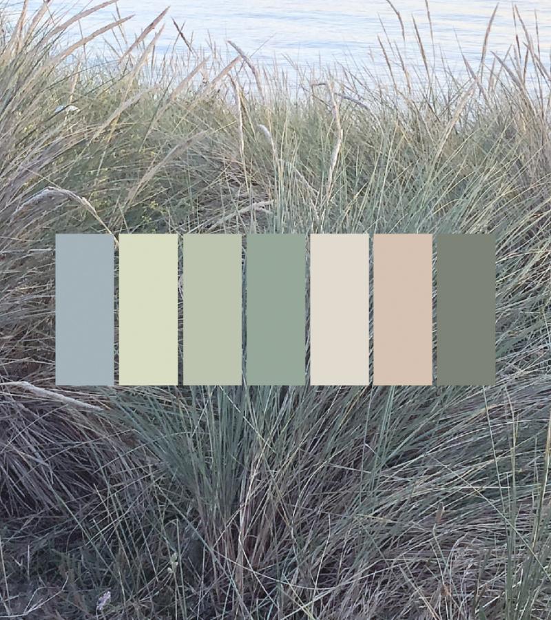
With this mood and behaviour in mind, start exploring and searching for images and inspiration that resonate with you, and that have the effect of creating this experience. The natural world can provide great inspiration for colour schemes that will positively support wellbeing. Explore natures landscapes and colours at different times of the day and notice how the light changes and how the colour effect you. You may also look through magazines, or perhaps you own a photo or painting that makes you feel the way you wish to feel in the room you are designing. It may even be an object, a textile, or treasured keepsake from a holiday that you positively connect with. As you are researching really think about your emotional response to the images or objects that you are drawn to. Do you like them because they are beautifully presented as the latest trend, or do you really like them because of how they make you feel. How does the image or object make you feel?
When you find a good match between the experience you wish to create and the feeling created by an image or object that you love, you have found your starting point. This step in the process can be really quick if you already have something in mind, or may take a while. Don’t rush it!
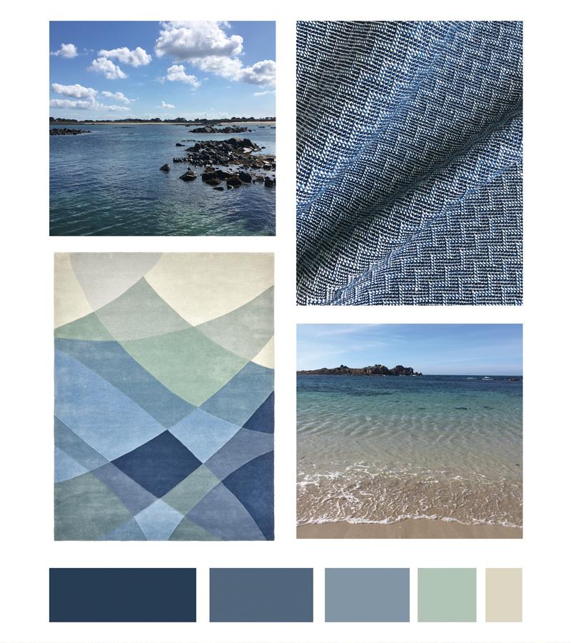
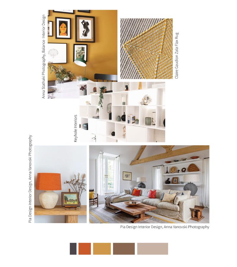
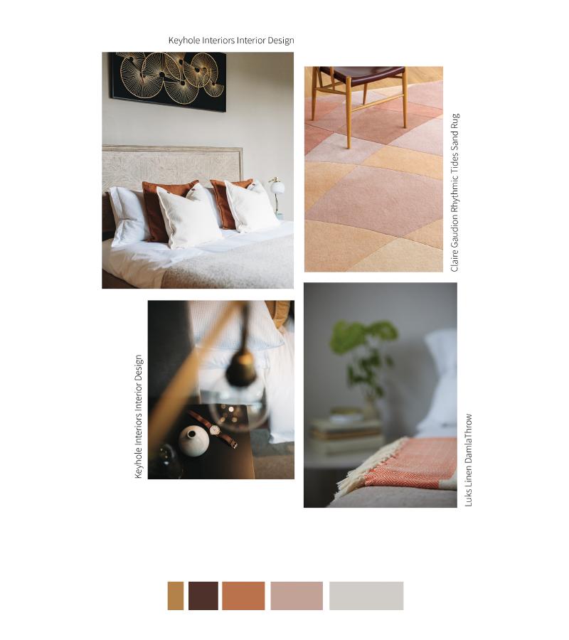
The colours of your chosen image or object are your starting point, giving you a colour palette that you have already emotionally connected with. Colour is a powerful language. It communicates a mood which affects our feelings and behaviours, and of all our sensory responses, colour is the first thing we react to. It affects us on physiological and psychological levels. Colour plays such an important role in our emotional reactions to anything visual that you will have chosen an image / object which is made up of colours that you’ve instinctively connected with. You have already considered how these particular colours trigger your emotions, and the mood that they create for you.
This step is about identifying and exploring these colours more closely, and your reactions to them. First, take notice of how many different colours, tints, shades and tones you can see. Are the colours predominantly warm or cool? Do the colours appear fresh and pure, or tinted by white, or shaded by black or grey tones?
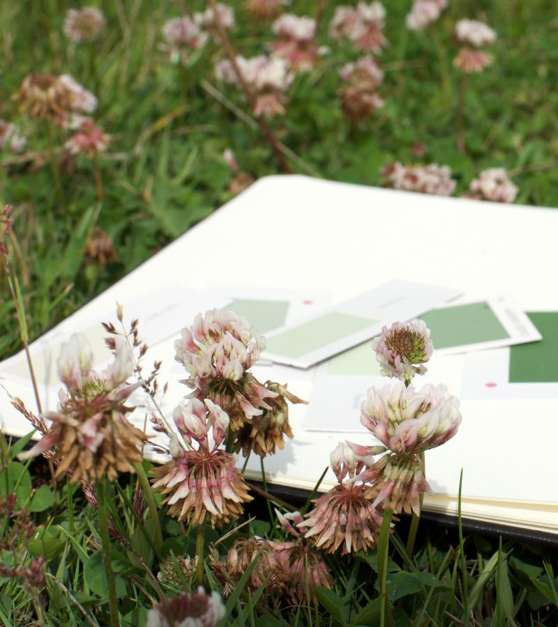
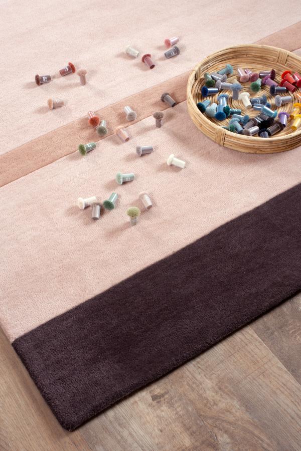
Identify the colours one by one (there may be many of them, so select the main colours), and find a colour sample to match each of the colours. This may be a paint chip from a paint company colour chart, a bottle top or shell, a scrap of fabric, a piece of paper torn from a magazine, or even a leaf or other material find. This is so that you have some individual colour samples to work with for the next step.
Take notice the scale and proportion of each colour in your image or object. The next step is to play around with the combinations and proportions of these colours and explore how this changes your response to the palette.
Use a plain surface to work on to begin creating a colour mood board. Begin moving your colour samples around, playing around with proportions of each colour and notice how the amount of a colour used changes the overall effect. Also try eliminating some of the colours, and then adding them back in to explore how this changes the overall mood of the palette. Does one option look and feel better to you that the other. Remember the mood you are trying to create. For example, if your palette includes greens, pinks and yellows, and you added a lot more yellow, this will undoubtedly change the mood, is this what you want? Does it need more of one colour, or less of another to create the atmosphere you want?
Play around with the colours until you find the right balance for you. You may not need to include all of the colours you can see in your starting point, you might hone in on a small detail from the image or object. And, as you start to change the scale and proportions of colours, tailoring it to your needs, you may find you are moving further away from your starting point. This is fine. You can set your ‘starting point’ aside as you are now personalising your palette to create the specific mood for you. If your colour palette is quite full of colour, perhaps consider adding some neutral colours to create ‘breathing’ space for the colours. You may or may not prefer the results. All the time review your emotional response, and ask yourself how the revised palette makes you feel.
As you are experimenting with your combinations of colours, think about the light in your space. Is it predominantly naturally lit, or artificially lit? Do you need to add warmth to the space? Do you want the space to feel bigger with lighter and less saturated colours? The colours you choose can influence all of these factors.
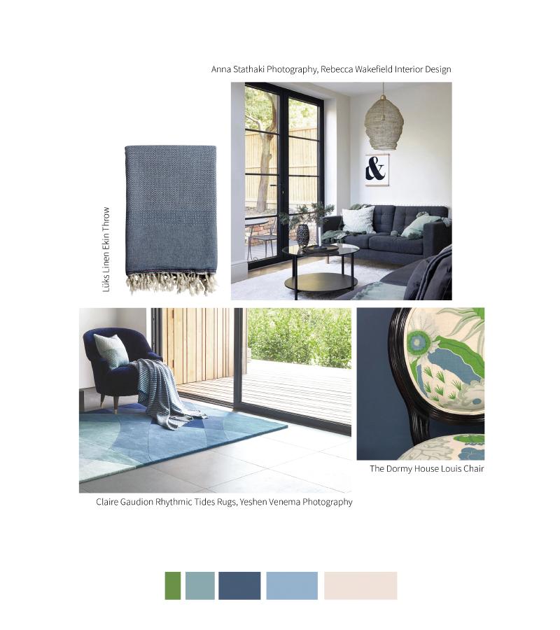
Colour mood boards are a great way to create a colour palette. The palette you have created includes the right colours and proportions of colours to create the look and feel you want. Once you are happy with the colour palette you can start translating this into a room scheme.
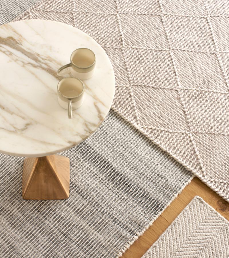
You can select furniture, paint colours or wallpaper, rugs, fabrics and accessories that reflect the colour scheme that you have designed. Remember to keep to the proportions of colour. If you only need a hint of yellow, this would best suit a small accessory, rather than your wall colour.
Before you make any final decisions and purchases, we recommend getting some samples. Test out the paint colour you have selected for the walls by painting a sample pot onto a large piece of paper (plain wallpaper lining is useful for this), request swatches of fabrics and rugs, and place these in your room. Take a few days to explore how the colours look and feel at different times of the day in the changing light. Is the balance right? Does it feel right to you? Does it make you happy?
Home tells a story of you, so it’s all about tuning in to what makes you happy, and how colour combinations make you feel.
If you would like advice on colour, we are here to help. Contact us here for a free consultation.
You may also be interested to read our other articles about colour, How we React to Colour, and Fascinating and Useful Things to Know about Combining Colours.