Your Cart is Empty

We all react to colour, often even without realising that we are doing so. If fact it’s one of the first things we react to in any space at any time. And we all react differently. So knowing how to use colour is about finding the shades that resonate with you and understanding how we perceive colour in the spaces we are in.
Describing colours using phrases such as ‘green is relaxing’ may have much truth to it, but it doesn’t share the whole story. Green is relaxing for many people. But, there so many shades of green and we all perceive colour from our own personal viewpoint. So anybody’s take on the colour green can be quite different. For some, the preferred green to create a relaxing aesthetic may be a soft minty green, or a pale leaf green. For another, a rich forest green may have a more relaxing effect. There’s a whole spectrum of greens, from the softest, palest celadon to the brightest of limes. Any of these shades of green can create quite a different mood or atmosphere and trigger very different emotional reactions for people. There is probably a green for everyone, and it’s a matter of finding the shade that resonates with you.There are millions of colours in the world, and while each colour can be described according to a general family of colours, such as ‘green’, there are infinite variations of saturation and brightness.
The combinations of colours that surround us every day create even more complex behavioural and emotive reactions. This is because we don’t usually see just one colour at any one time. Our perception of colours is usually our reaction to a combination of different colours at the same time.
Imagine an empty room painted in a vibrant, rich saturated orange colour. This is a strong colour which might be described in a number of ways by different people… energising, intense, uplifting, joyful, playful, etc. Orange is a hot colour from the red end of the colour spectrum. Colours from this end of the visible spectrum are often described as ‘advancing’ colours. They can feel closer to us than cooler shades such as blue and green, which in contrast are described at ‘receding’ colours. Chroma is also relevant here. The higher the chroma (the more saturated and intense it is) the more advancing it appears. So, the colour of a room can make a space bigger or smaller, or change our perception of its’ spacial layout. Considering the varied emotive responses to colour that we each experience, a room decorated predominantly in bright orange may to some people feel intense, perhaps even intimidating, while to others, these advancing characteristics may feel cosy and cocooning.
Add to all of this personal learned memories of colours. Colour associations are powerful factors when thinking about how we each respond to colours in the present moment. If we’ve experienced a very happy memory which is linked to a particular colour this colour will have positive connotations for us. On the contrary, if we have negative memories around a particular colour we are less likely to favour this colour. On top of all this, there are cultural beliefs which affect our perception of colour. So as you can see, colour is quite a complicated phenomenon.
Let’s go back to the bright orange room. If our sensory response to orange is too intense, we can dilute it. We can balance these advancing characteristics with colours that have receding qualities. Blue colours tend to feel further away from us. Painting a blue wall at the end of a white room can elongate the feeling of the space. Painting a red or orange wall at the end of the room will have the opposite affect and draw that far wall closer changing the perception of the space. Balancing these hot and cold colours together can create just the right equilibrium. Complimentary colours such as blue and orange used in combination in the right proportions can create a harmonious and balanced feel to a space.
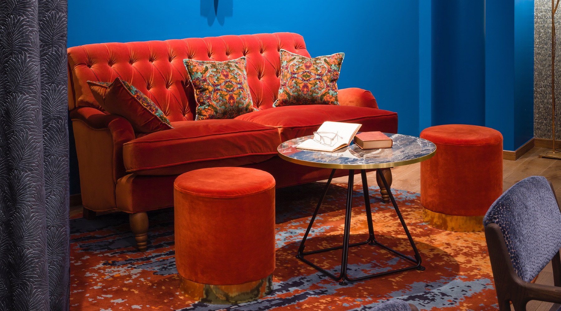
Image: Interior Design by Russell Sage Studio for Sofitel Brussels Hotel, Photography by Jo Pauwels
Mixing different shades or tint or tones of orange, as you might expect, will once again change our perception of the colour. Colour properties can in effect be ‘diluted’ by adding white or grey or black or another hue. A bright orange could become a deeper burnished terracotta shade, or a paler coral tint.
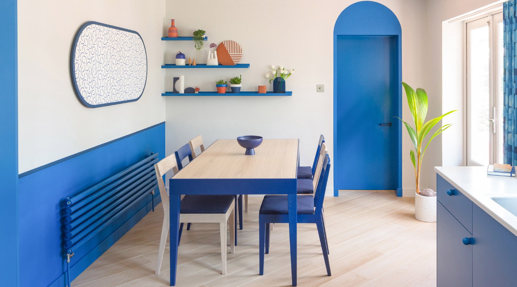
Image: Interior Design by Colour + Shape, Photography by Matthew Smith
Another consideration is light, whether natural light or artificial light. All colour is affected by light. So how we are seeing these colours may change throughout the day, and through the seasons. The more light there is available the more saturated the colour will appear. The less light the more faded a colour will appear then of course there is the tone quality of the light. Strong midday, Midsummer daylight, to dusk in midwinter, or north easterly light to south westerly. There are so many variables that affect how we perceive colour, and in turn how we each react to these both in our mood and behaviour how we feel how we enjoy or not the spaces that we live in. As Charles Daubigny, a french painter once said, “Light has a language. We have to make her talk, we have to make her sing”.
With all of the above considered, it is no surprise that some people are quite nervous about designing with colour, and really don’t know where to start.
Here’s a simple technique that you can use for designing with colour in your home. Find a starting point that you love. Select a painting or an object that you are drawn to for it’s colour palette. Find a photo of nature, or a landscape that you love. Something that really resonates with you. Any one of these is your starting point. You have already connected with these colours in a positive way. From this starting point, you can build your colour scheme using the colours that resonate with you.
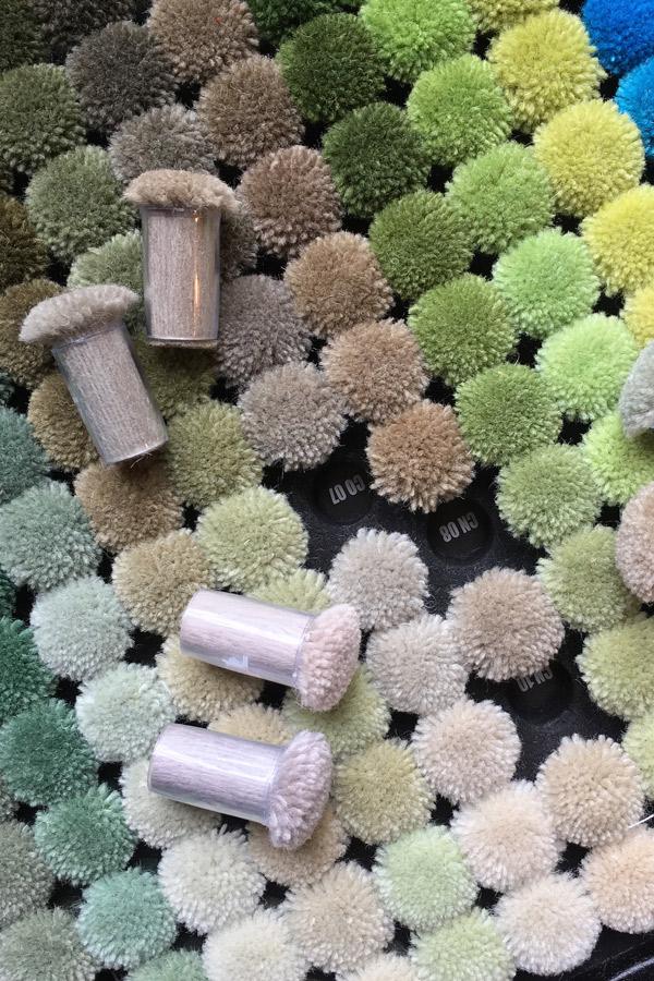
Start to explore the colours in your image or object. Take notice of how many different colours you can see, the scale and proportion of each colour.
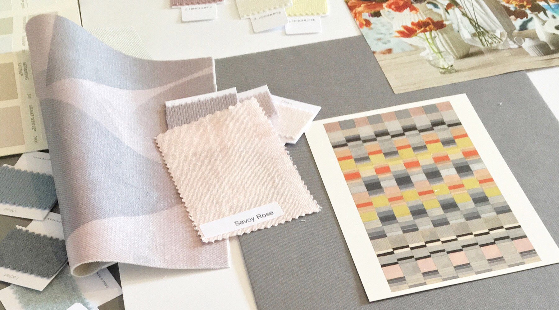
Think about how these colours make you feel in this combination. And, how would your perception change if you changed the proportion of the colours for example added more of one colour and reduced the amount of another? A useful way to play around with these ideas and explore your reactions to colours is to create a mood board. Include your starting point, or a photo of it, and find other references to match these colours – these can be pieces of paper, cutouts from magazines, objects from the natural world, fabrics or paint chip colour charts. Start adding these colour references to your mood board. Move things around, and play around with proportions until you find the right balance of colours for you. You may not need to include all of the colours you can see in your starting point, you might hone in on a small detail from the image or object.
As you are experimenting with your combination of colours, think about the light in your space. Is it predominantly naturally lit, or artificially lit? Do you need to add warmth to the space? Do you want the space to feel bigger? The colours you choose can influence all of these factors.
Colour mood boards are a great way to create a colour palette, along with a sense of how much of each colour should be combined together for the right effect. Now you can start translating this into a room scheme, by selecting furniture, paint colours or wallpaper, rugs, fabrics and accessories that reflect the colour scheme that you have designed. You can use these colours in different ways to design your whole home. Continuing this theme of colours and textures throughout your home will create a feeling of balance and flow from room to room.
Before you make any final decisions, paint some sample colours onto large pieces of paper (plain wallpaper lining is useful for this), request swatches of fabrics and rugs, and place these in your room. Take a few days to explore how the colours look and feel at different times of the day in the changing light. Is the balance right? Does it feel right to you? Does it need more of one colour, or less of another to create the atmosphere you want? Does it make you happy? Your home influences your mood, so it’s important to get the tone right. Home tells a story of you, so it’s all about tuning in to what makes you happy.
As expressed by Michelle Ogundehin, former ELLE Decoration Editor-in-Chief
“Sometimes I think ok, am I really saying that nice paint colours and a few cushion covers can cure all ills? No, but also actually yes. Because where you come home to, whatever you call home, however you define your family, has enormous power. It is the one piece of the world that you have a degree of control over, whether you rent or own. We need to start harnessing that power to help ourselves, because once we help ourselves then we can have a better impact out there and we can, I believe, be better people.” Michelle Ogundehin
If you would like advice on colour, and how to select the right colours for you, we are here to help. You can send us your mood board or questions about designing with colour and our designer will be happy to advise and make recommendations. Contact us here for a free consultation.